Dark Green Dining Rooms Done Right: The Brass & Rattan Formula
A dark green dining room is the single most efficient way to tell your dinner guests exactly who they’re dealing with. Not the beige-and-shiplap crowd. Not the people who bought a matching seven-piece set from a catalog and called it a day. Our kind. The ones who understand that a dining room is a stage, not a storage solution for chairs, and that a deep, layered green — done with brass and rattan instead of the usual sad gray runner — is the one color story that reads as expensive and slightly haunted in the best possible way.
Here’s the problem with almost everything written about dark dining rooms: it stops at “paint it green” and calls it a transformation. That’s not a design plan, that’s a paint chip. If you actually want a room that looks like it belongs in a Belgravia townhouse and not a rental unit trying too hard, you need the full formula — the exact greens, the brass hardware that doesn’t read cheap, the rattan placement that keeps things from feeling like a funeral parlor, and the layering that makes deliberate chaos look intentional instead of accidental.
We built this guide because we were tired of seeing “dark and moody dining room ideas” posts that show one photo of a green wall and call it a day. Below are eight specific, buildable moves — not vibes — for pulling off this look properly, brass and rattan included.
Why Dark Green Is the Dining Room Color Our Kind Has Been Waiting For
Dark green does something white walls never will: it makes food, candlelight, and skin tones look better. It’s the reason old hunting lodges and private members’ clubs have used it for centuries, and it’s the reason this palette photographs like a painting instead of a listing photo. But most people get scared halfway through — they pick a green, panic that it’s “too much,” and add a beige rug to apologize for it. Don’t apologize. More is a religion in this house, and a room this saturated is where you go to practice it properly.
The brass-and-rattan combination isn’t decoration, it’s temperature control. Straight dark green with black and white feels like a museum after hours — dramatic, but cold. Brass brings the warmth of candlelight even when the candles aren’t lit. Rattan brings texture and a little bit of the outside in, so the room doesn’t collapse into a single mood. Get this balance right and the whole scheme stops looking like a color choice and starts looking like a decision you’ve been building toward your whole life.
Choose a Green That Reads as Deliberate, Not Depressing
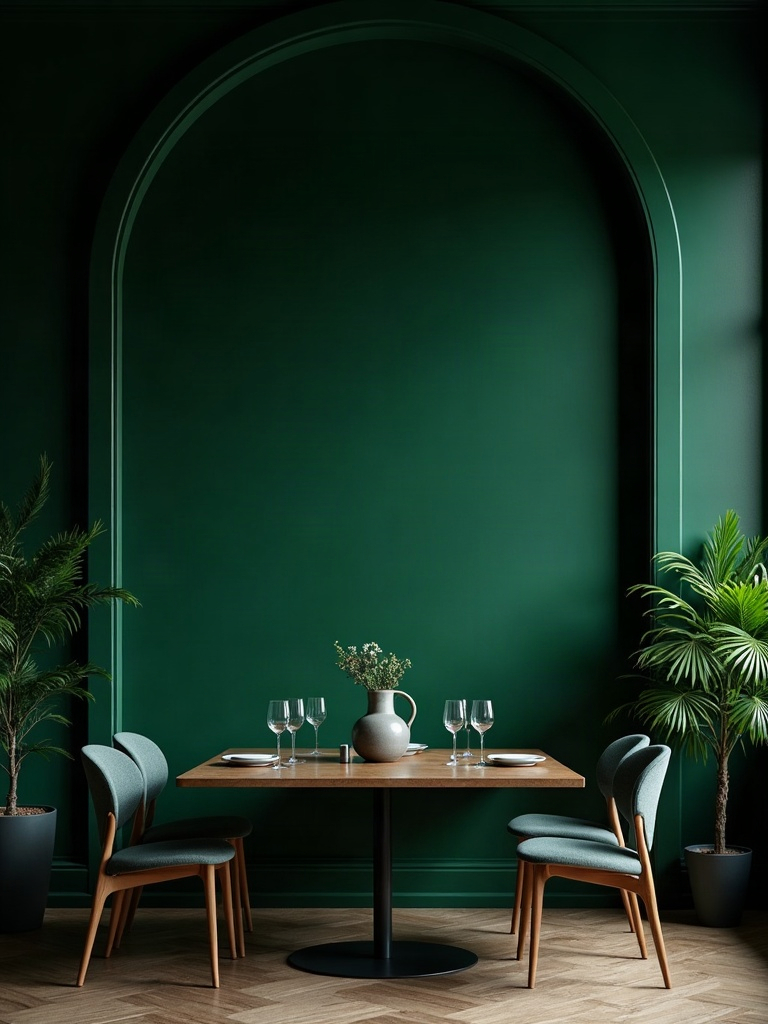
Most dark green dining room disasters start at the paint counter. People grab a green that leans too blue, too gray, or too close to hospital-scrub territory, and the whole room ends up feeling institutional instead of intentional. What you actually want is a shade with real depth — something closer to bottle, hunter, or a near-black forest tone that shifts depending on the light hitting it. That shift is the whole point. A flat, single-note green just sits there. A green with movement in it looks alive.
Test any candidate on the actual wall, in the actual light, at the actual hour you’ll be using the room — dining rooms live at night, so a swatch that looks perfect at 2pm can go muddy and sad by 8pm under a warm bulb. Paint a section behind where your sideboard will sit, not a random patch near the door, because that’s the wall your eye will land on every single time you walk in. This is not the room to rush a decision on. Give it a week.
Once you’ve committed, go all the way — ceiling included, if you’re brave, or at minimum trim in a close, slightly darker or lighter value of the same green rather than a jarring white. A space with white trim reads like a compromise. One that commits fully reads like a statement.
Make the Brass Fixture Non-Negotiable
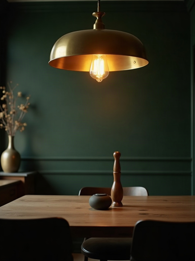
If you’re going to spend real money on one thing, spend it here. The overhead fixture is doing more work than any other object in the room — it’s the thing guests look up at during the entire meal, and against dark walls, a flat brushed-nickel flush mount just disappears into the gloom. Aged, unlacquered, or antiqued brass catches candlelight and lamp light and throws warm reflections back onto the green, which is exactly the effect that makes people ask who did your dining room.
Scale matters more than most people think. A pendant or chandelier that feels slightly too large for the table reads as confident; one that feels correctly sized often reads as timid. Hang it low enough that it becomes part of the tablescape, not a ceiling afterthought. A piece like this antiqued brass chandelier does exactly what a moody dining space needs — warmth, presence, and just enough shine to keep the room from going flat.
Don’t stop at the ceiling fixture. Brass candlesticks, brass drawer pulls on the sideboard, even a brass-rimmed mirror all reinforce the same metal story throughout the room, which is what separates a considered space from one that just happened to have a gold light fixture in it.
Bring Rattan In Through the Chairs, Not the Table
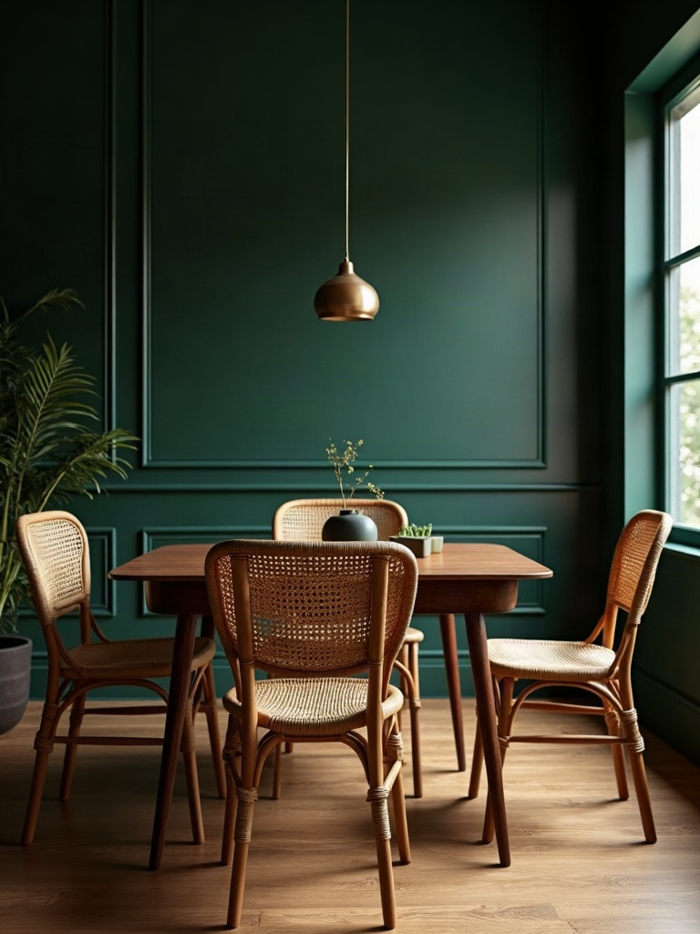
This is the detail that separates a genuinely well-styled room from one that’s trying too hard to hit every trend at once. Rattan on the table itself — a rattan-topped surface — tends to read as beachy or overly casual against a formal dark backdrop. Rattan on the chairs, specifically the backs, does the opposite: it softens the sharp lines of a dark, moody room without pulling the whole space toward “coastal.”
Woven cane or rattan-back dining chairs paired with a solid, dark wood or black-lacquered table create exactly the contrast this look is begging for — structure against texture, dark against warm, formal against organic. This set of rattan-back dining chairs is the kind of piece that does the heavy lifting without demanding attention, which is precisely the job a supporting player should have in a room where the walls are already shouting.
If reupholstering or replacing all your chairs isn’t in the budget, even two rattan-back chairs at the head of the table, mixed with upholstered chairs down the sides, gives you the same textural payoff. This is not a look that requires a matching set. It requires a conversation between materials.
Ground the Room With a Rug That Argues Back
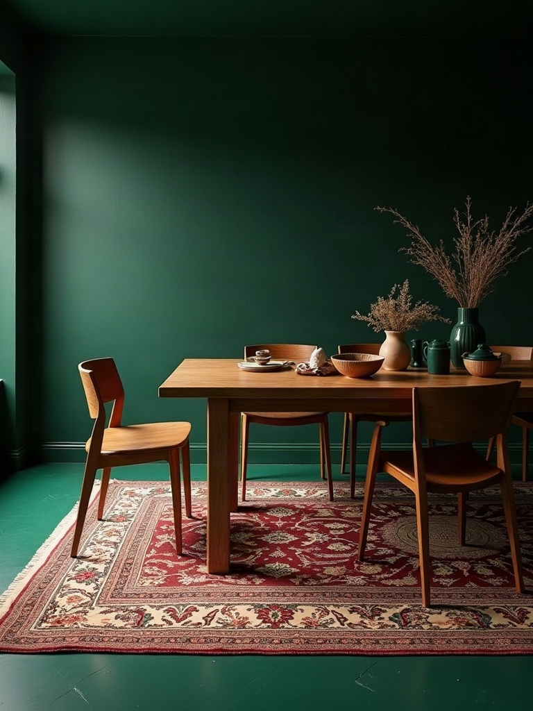
A pale, safe rug underfoot is the decorating equivalent of whispering in a room you just filled with a bold color statement. The floor needs to hold its own against the walls, or the whole scheme feels top-heavy. Look for a rug with a pattern and depth of its own — a vintage-style Persian or Oushak in rust, burgundy, or deep gold plays beautifully against deep green without competing for the same visual space.
Pattern-on-pattern is not a risk here, it’s the assignment. A patterned rug layered with a rattan chair and a brass chandelier is exactly the kind of curated obsession that makes a room feel gathered over years instead of ordered from one catalog in an afternoon. This vintage-style Oushak area rug brings in the warmth and worn-in richness that keeps things from feeling like a showroom.
Size it generously — all four chair legs should stay on the rug even when pulled out from the table. A rug that’s too small doesn’t just look wrong, it makes the whole room feel like it’s floating unanchored in its own drama.
Commit to Drapery Instead of Blinds
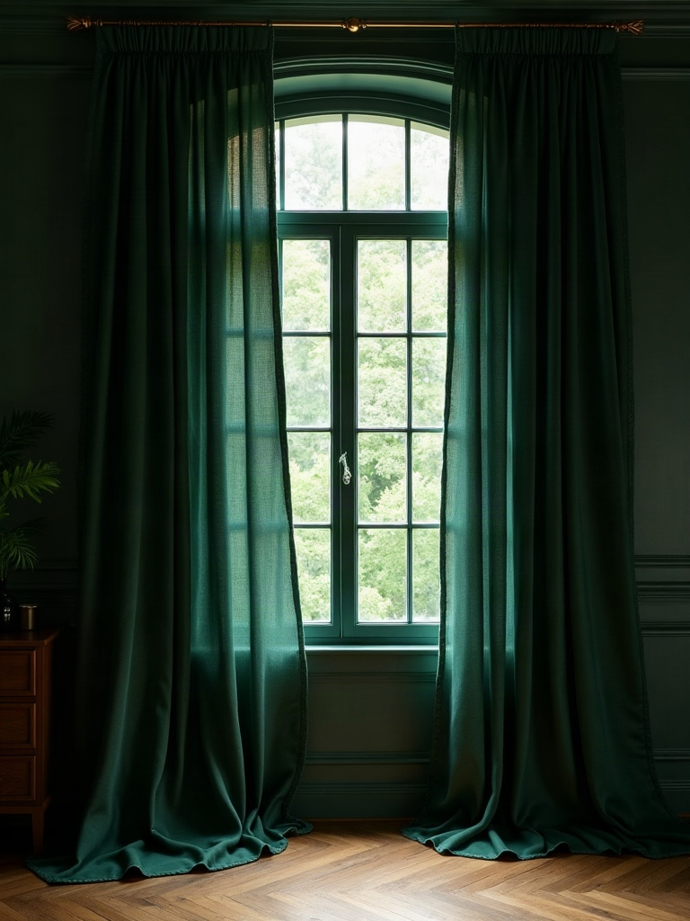
An empty window in a room this dramatic is a missed opportunity, full stop. Bare glass or a set of plain white blinds against a rich green wall reads like the space stopped halfway through getting dressed. Floor-length drapery in velvet or a heavy linen blend, in a jewel tone that either matches or intentionally contrasts the wall — think a deep burgundy, aubergine, or even a patterned botanical print — finishes the room the way a good piece of jewelry finishes an outfit.
Hang the rod as close to the ceiling as your window allows, well above the actual window frame, and let the panels puddle slightly on the floor. This single move adds height and drama faster than almost anything else on this list, and it costs a fraction of what a renovation would. Try heavyweight velvet curtain panels in a color that argues gently with your walls rather than matching them exactly.
If you’re renting and can’t install permanent rods, tension rods and clip rings still get you the same silhouette. There is no version of a finished dark green dining room that skips the windows.
Layer Art Salon-Style, Frame to Frame
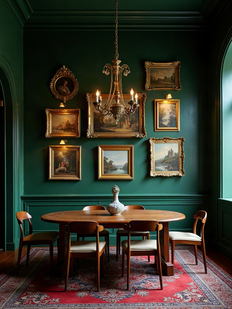
A single, small, centered piece of art on a saturated wall looks apologetic — like the room isn’t sure it deserves to be looked at. This color is a backdrop built for a gallery wall, hung salon-style with frames touching or nearly touching, in a mix of gold, brass, and dark wood. Oil-style florals, moody portraiture, and vintage botanical prints all read exceptionally well against this particular green because the color pulls the same undertones out of the artwork.
Don’t worry about matching frame finishes perfectly. A room like this rewards a slightly mismatched, collected-over-time gallery wall far more than a uniform set from a single store. Mix scale, mix orientation, and let the wall feel like it grew there rather than arrived in one delivery.
This is also where the room earns its reputation as a conversation piece — nobody remembers the beige wall with the single framed print. Everyone remembers the room where every wall had something to say.
Style the Sideboard Like It’s the Whole Point
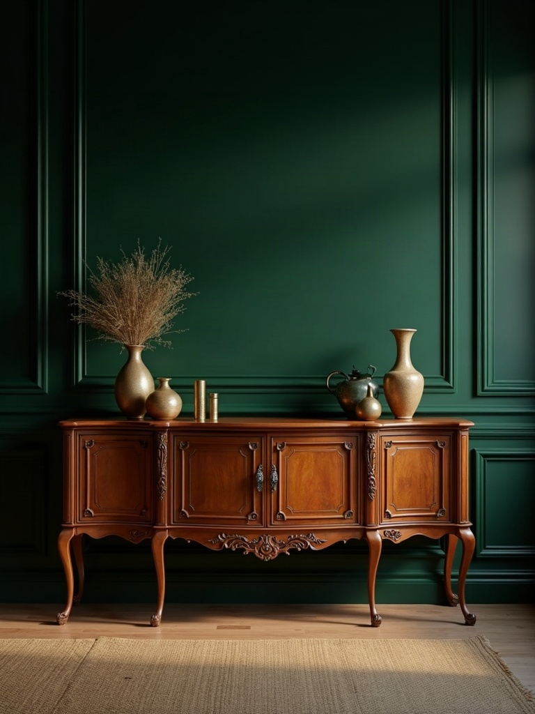
A room like this without a properly dressed sideboard is one that peaked at the paint stage. The sideboard is where brass, rattan, and green all get to interact at close range — a brass tray holding a collection of glass decanters, a woven rattan basket or box for texture, a stack of leather-bound books, a single dramatic lamp instead of overhead light alone. This is curated obsession in physical form, and it’s the difference between a dining room that’s staged and one that’s lived in by someone with actual taste.
Vary height constantly. Nothing kills a good vignette faster than five objects at the same eye level. Anchor with something tall — a lamp or a large vase — then build down and around it with smaller objects in odd numbers. A well-chosen brass and glass decanter set does double duty here: functional at the table, gorgeous on display against the walls.
Let this surface change over time. A sideboard that looks exactly the same in six months isn’t being used properly. Swap in seasonal branches, new candlesticks, a different stack of books. A room like this should always feel slightly in motion.
Break the Matching-Set Rule on Purpose
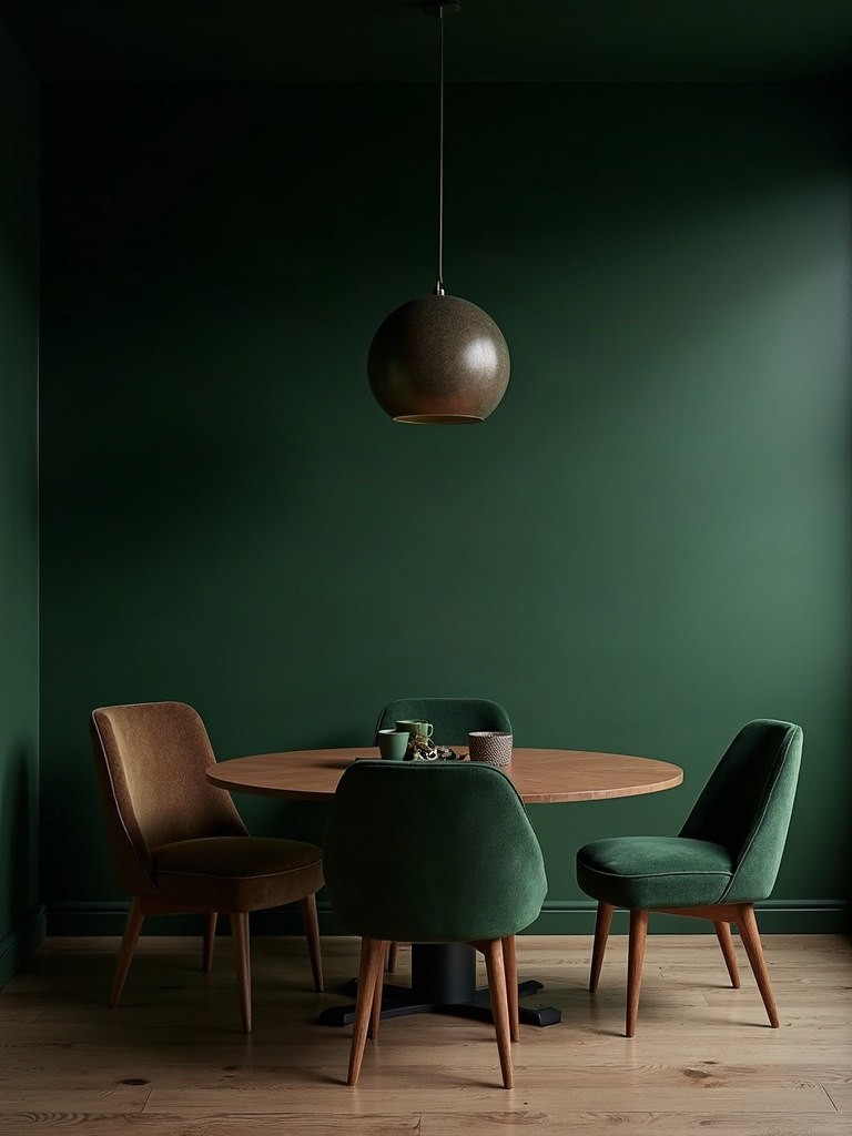
Here’s the part every generic dark dining room roundup gets wrong: they show you a matching table-and-chair set and call it done. A room built entirely from one showroom collection will always look flatter than one built from pieces that were chosen individually, over time, for how they actually work together. Mix a vintage or antique table with newer rattan chairs. Pair a modern brass fixture with an inherited, slightly mismatched set of candlesticks.
This is where deliberate chaos becomes a design principle instead of a mess. The goal isn’t randomness — every piece still needs to share a material or color thread with the room, whether that’s brass, dark wood, or a warm undertone in the green. But the pieces themselves should look like they were selected by a person with opinions, not assembled by a set list.
A dark green dining room that looks like it was purchased in a single afternoon will always read as decorated. One that looks like it was built over years, argument by argument, piece by piece, reads as designed. That’s the entire difference, and it’s the one no matching set can buy you.
Frequently Asked Questions About Dark Green Dining Rooms
What shade of green works best for a dark dining room?
Deep, complex greens with a hint of black or brown in the undertone — bottle green, hunter green, or a near-black forest shade — work best for a dark green dining room because they shift subtly with candlelight and lamp light instead of sitting flat on the wall. Avoid anything too blue or too bright, which can read as cold or overly saturated once the sun goes down.
Does dark green make a small dining room feel smaller?
Not if you commit fully. A half-painted room, with white trim and ceiling breaking up the color, is what actually makes a small space feel chopped up and smaller. Painting the walls, trim, and even the ceiling the same dark green creates a cocoon effect that makes the boundaries harder to perceive, which often makes a small dining room feel more atmospheric rather than cramped.
How do you keep this kind of room from looking dated?
Avoid pairing dark green with only one other metal or texture. A room that mixes brass, rattan, aged wood, and at least one patterned textile stays current because it reads as collected rather than trend-chased. The spaces that feel dated are almost always the ones that leaned on a single decorating idea — like green plus gold and nothing else — instead of layering multiple textures the way this guide walks through.
What lighting works best in a dark green dining room?
Warm, layered lighting is essential. A single overhead fixture, ideally in antiqued or unlacquered brass, should be supported by at least one additional light source — a sideboard lamp, wall sconces, or candlesticks — so the room never relies on one flat source of light. Dark green absorbs light more than pale colors do, so this kind of room typically needs more layered lighting than a bright white one to feel warm instead of gloomy.
Can you mix rattan with more formal or traditional dining furniture?
Yes, and it’s one of the best moves available. Rattan-back chairs paired with a formal antique or lacquered table create exactly the kind of material contrast that keeps a dark green dining room from feeling either too casual or too stiff. The formality of the table and the informality of the rattan balance each other, which is the same principle that makes brass and rattan work so well together throughout the whole room.