The Dark Academia Kitchen: A Maximalist Mashup Guide
Somewhere along the way, kitchens became laboratories. White quartz stretched wall to wall, matte black hardware repeated like a uniform, an island lit like an operating table. We’re done with that. A dark academia kitchen refuses to apologize for having a personality — and it definitely doesn’t apologize for a chandelier hanging where the builder-grade flush mount used to live. If you’ve been quietly hoarding leather-bound novels, brass candlesticks, and a taste for oxblood paint with nowhere to put it, the kitchen is where dark academia finally collides with the one house religion we actually believe in: more is a religion, and the kitchen has been left out of the congregation for far too long.
What a Dark Academia Kitchen Actually Looks Like (Hint: Not a Pinterest Library)
Most dark academia content lives in studies and reading nooks — wingback chairs, stacks of Dostoevsky, a single dramatic lamp. Beautiful, but incomplete. This pairing borrows the palette and the posture of that world — oxblood, forest, ink, tobacco brown, brass gone slightly green at the edges — and forces it to cohabitate with the practical chaos of a room where people actually cook, spill, and argue about whose turn it is to do dishes. That friction is the point. This isn’t a costume kitchen built for photographs. It’s a curated obsession made functional, which is a much harder and much more interesting thing to pull off.
The mashup works because dark academia and maximalism were always secretly the same family. Both distrust bare walls. Both believe a room should look like it was assembled over decades by someone with opinions, not purchased in one Saturday trip. Your empty upper cabinet with nothing behind the glass is a missed opportunity, and so is that blank stretch above your stove that’s currently doing absolutely nothing for you.
The Eight-Piece Blueprint for a Dark Academia Kitchen That Doesn’t Read Like a Costume
Below are the eight moves that separate this look from a themed rental property. Do all eight and you’ve built a room. Do three or four and you’ve still made your point. Either way, we’re firmly in favor of doing more than you think is reasonable.
Blacken the Cabinetry Like a Rare Book Cover
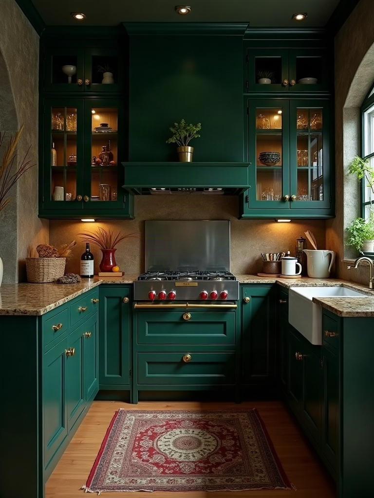
Forget the white shaker cabinet. The foundation of any dark academia kitchen is cabinetry in a color that reads like the spine of a leather-bound first edition: ink black, bottle green, or the deep oxblood you keep seeing described as “wine” but is really closer to dried blood in candlelight. This is not a subtle undertone situation — go saturated, go full-coverage, and let the color absorb light instead of bouncing it back at you.
Pair the dark cabinet color with a lighter, warmer countertop — a honed soapstone or a butcher block with real grain — so the room doesn’t collapse into a single dark mass. The contrast is what reads as intentional instead of accidental. A kitchen that’s uniformly dark just looks unfinished; a kitchen that’s dark with purpose looks like it was designed by someone who owns first editions and isn’t afraid to cook near them.
Hang a Chandelier Where the Builder Put a Flush Mount
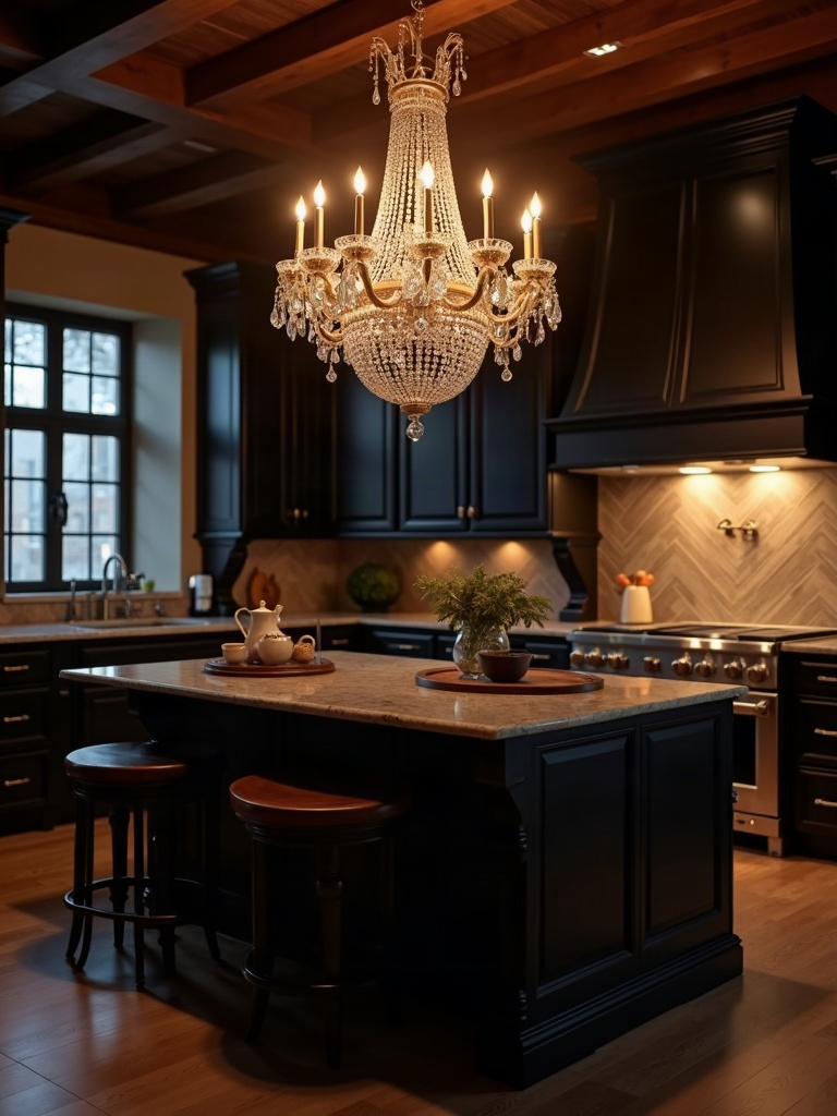
Nothing kills the mood faster than a bright, shadowless flush mount doing its best impression of a dentist’s office. The whole aesthetic runs on pools of warm light and deliberate shadow, which means your lighting plan has to work harder than “one fixture, centered, done.” Swap the flush mount for something with actual presence — an aged-brass chandelier, a wrought-iron fixture with candle-style bulbs, or a cluster of library sconces along one wall.
A piece like this aged brass chandelier with candelabra bulbs does more heavy lifting than almost anything else on this list, because lighting is the difference between “moody on purpose” and “kitchen where someone forgot to pay the electric bill.” Layer it with warm under-cabinet lighting on a dimmer, and let the overheads stay off more often than they’re on.
Trade the Subway Tile for a Library Backsplash
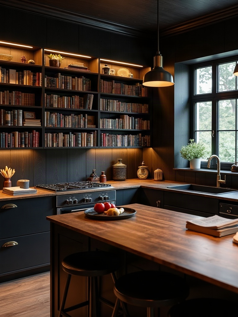
White subway tile is the try-hard-neutral kitchen’s load-bearing cliché, and it has no business here. Look instead for a backsplash that reads as texture and pattern rather than a blank grid: a deep green fluted tile, an aged mirror-glass panel that catches candlelight like a rare-books room, or — for the truly committed — a hand-painted botanical tile that looks pulled from a Victorian conservatory.
This is also where pattern-mixing earns its keep. A patterned backsplash against solid dark cabinetry and a busy runner on the floor isn’t excess for its own sake, it’s layering — and layering is the entire maximalist argument. If it feels like too much while you’re installing it, you’re doing it correctly.
Let Brass Do the Talking, Not Chrome
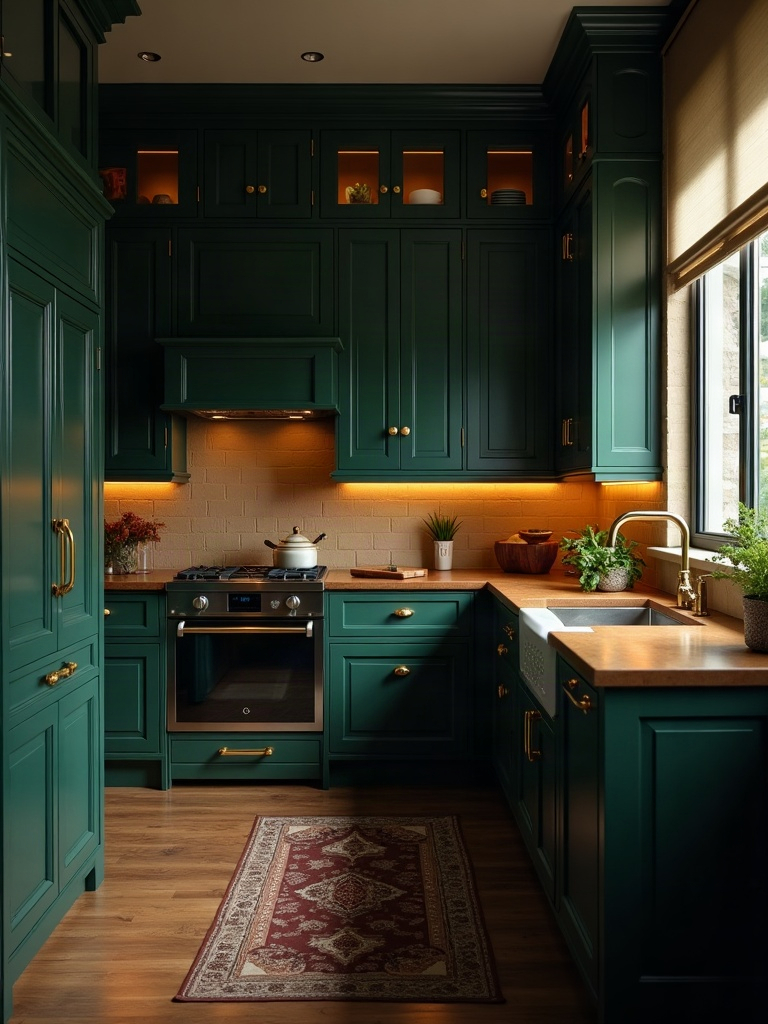
Chrome and brushed nickel are cold, modern, and completely wrong for this room. Every piece of hardware in this kitchen — cabinet pulls, faucet, even the trim on your range hood — should be warm metal: aged brass, unlacquered brass that’s allowed to patina, or a deep bronze that looks like it’s been handled by three generations of the same family.
Swapping hardware is the cheapest, fastest way to shift a kitchen’s entire personality, and unlacquered brass cabinet pulls are the single highest-leverage purchase on this list. They cost less than a weekend of takeout and they touch every single cabinet in the room.
Build a Cookbook Wall Like It’s a Personal Archive
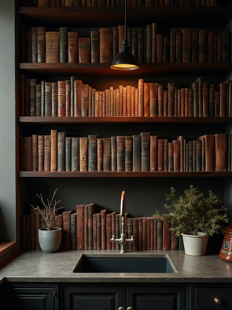
This kitchen needs books the way a stripped-down kitchen needs nothing at all. Not a single decorative stack — a genuine, overflowing archive of cookbooks, old botanical field guides, and whatever hardcovers you already own that happen to have good spines. Install open shelving or a proper library ladder against one wall and let the collection sprawl.
This is deliberate chaos in its purest form: no two books matching, no color-coding, just decades of taste stacked in a way that looks accumulated rather than staged. A rolling library ladder earns its keep here twice over — once as hardware, once as the single most photographed object in the room.
Choose Velvet Curtains Over Roman Blinds
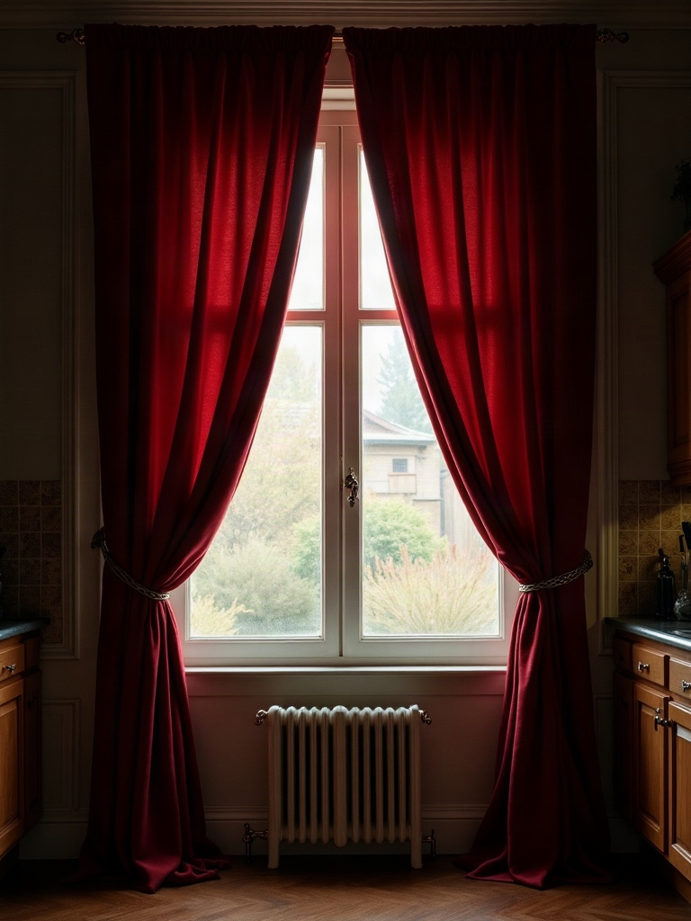
Roman blinds are efficient, tidy, and belong nowhere near this project. A dark academia kitchen wants heavy, floor-length curtains in a rich fabric — forest velvet, deep burgundy, or a faded tapestry-weight print — even over the sink window, even though everyone will tell you curtains and kitchens don’t mix. They mix. They just take commitment.
The weight and drape of heavyweight velvet curtain panels softens every hard surface in a kitchen — tile, stone, glass — and does more to sell the mood than almost any single other change on this list. Pull them back with a tasseled tieback and let them pool slightly at the floor. Neat hems are someone else’s problem, not ours.
Hunt Down a Butcher’s Block With Someone Else’s History
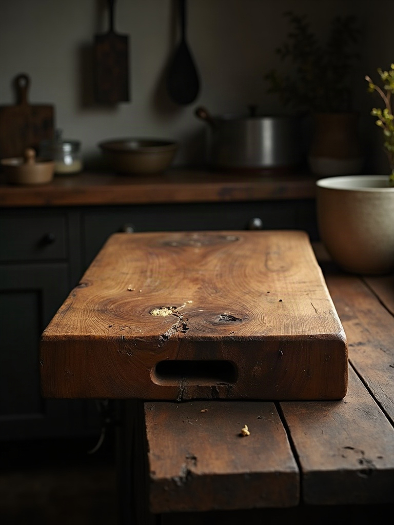
New butcher block reads as a kitchen showroom. Vintage or reclaimed butcher block — scarred, stained, worn smooth in the center from decades of someone else’s dinners — reads as inherited, which is exactly the point of dark academia’s entire worldview. Antique shops, estate sales, and reclaimed-lumber dealers are where this piece actually lives; it’s rarely the star of a big-box catalog.
If you can’t find an antique original, a reclaimed-wood rolling kitchen cart gets you most of the way there and gives you extra surface area for the sprawling ingredient jars and brass canisters this kitchen is going to accumulate anyway.
Add the One Wrong Object on Purpose
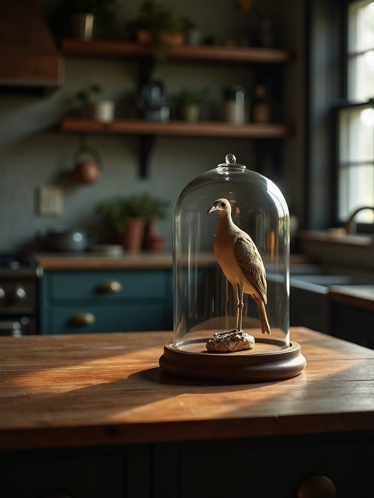
Every kitchen built this way needs a single object that has no business being in a kitchen at all — a taxidermy bird under glass, an antique globe on top of the fridge, a gilt-framed oil painting of someone’s ancestor watching you make coffee. This is the move that separates “curated obsession” from “theme park.” It signals that the room wasn’t decorated to a brief; it was built by someone with a genuinely strange and specific point of view.
Don’t overthink this one. It should feel slightly wrong the first week and completely correct by the third. That’s the whole test.
The Three Rules That Keep Deliberate Chaos From Becoming a Fire Hazard
A kitchen built on maximalist instincts like this one can tip into genuinely unusable territory if you ignore basic kitchen physics. Rule one: nothing flammable within candle-flicker distance of the actual stove — save the real candlelight glow for the dining side of an open kitchen and let warm bulbs do the work near the range. Rule two: keep at least one full wall or run of counter genuinely clear for prep, because deliberate chaos still needs somewhere to chop an onion. Rule three: ventilation and grease don’t care about your aesthetic, so open shelving of books and objects belongs away from direct splash zones, not directly above the stovetop.
Those three rules aside, there is no such thing as too much in this kitchen. The whole point of the mashup is that dark academia’s moodiness and maximalism’s abundance were never in conflict — they were just waiting for someone to combine them somewhere other than a library. Our kind has been doing this in living rooms and dining rooms for years. It’s time the kitchen caught up.
Frequently Asked Questions About Building a Dark Academia Kitchen
Is a dark academia kitchen too dark for cooking?
Not if you layer your lighting correctly. The walls, cabinets, and decor can go as dark and saturated as you want, as long as task lighting over the stove, sink, and prep areas stays bright and warm-toned. The mood comes from ambient light and color, not from leaving yourself squinting at a cutting board.
What paint colors work best for this look?
Oxblood, hunter or bottle green, ink black, tobacco brown, and deep charcoal-plum are the core palette. Choose one dominant color for cabinetry and let one or two supporting tones appear in the backsplash, walls, or textiles so the room has depth instead of feeling like a single flat block of color.
Can I do this aesthetic in a rental?
Yes — hardware, curtains, open shelving with books, lighting swaps (keep the originals to reinstall later), and a rolling cart or butcher block island get you most of the look without touching a single wall. Peel-and-stick wallpaper on a backsplash or single accent wall is the highest-impact renter-safe move.
How do I keep this look from feeling like a theme restaurant?
Use real, mismatched objects instead of matched decor sets, and let at least one item feel genuinely odd or personal rather than purchased to match. A kitchen that looks assembled from a single catalog page is the exact opposite of what this aesthetic is chasing.
What’s the fastest way to start a dark academia kitchen without a full renovation?
Start with hardware and lighting — both are cheap, reversible, and touch the entire room instantly. Add curtains and a cookbook shelf next. Save cabinet color and backsplash, the two most expensive and permanent changes, for when you’re ready to commit fully.